The Challenge
The task of redesigning the checkout process is a multifaceted challenge that involves addressing several key issues. Some of the challenges that you can consider in your case study are:
Make the checkout process more accessible and intuitive for different types of customers and services.
Prevent fraud and reduce chargebacks without compromising customer experience of rejecting legitimate transactions.
Optimize the checkout flow and reduce the number of steps, fields, and distractions that can cause customers to abandon their carts.
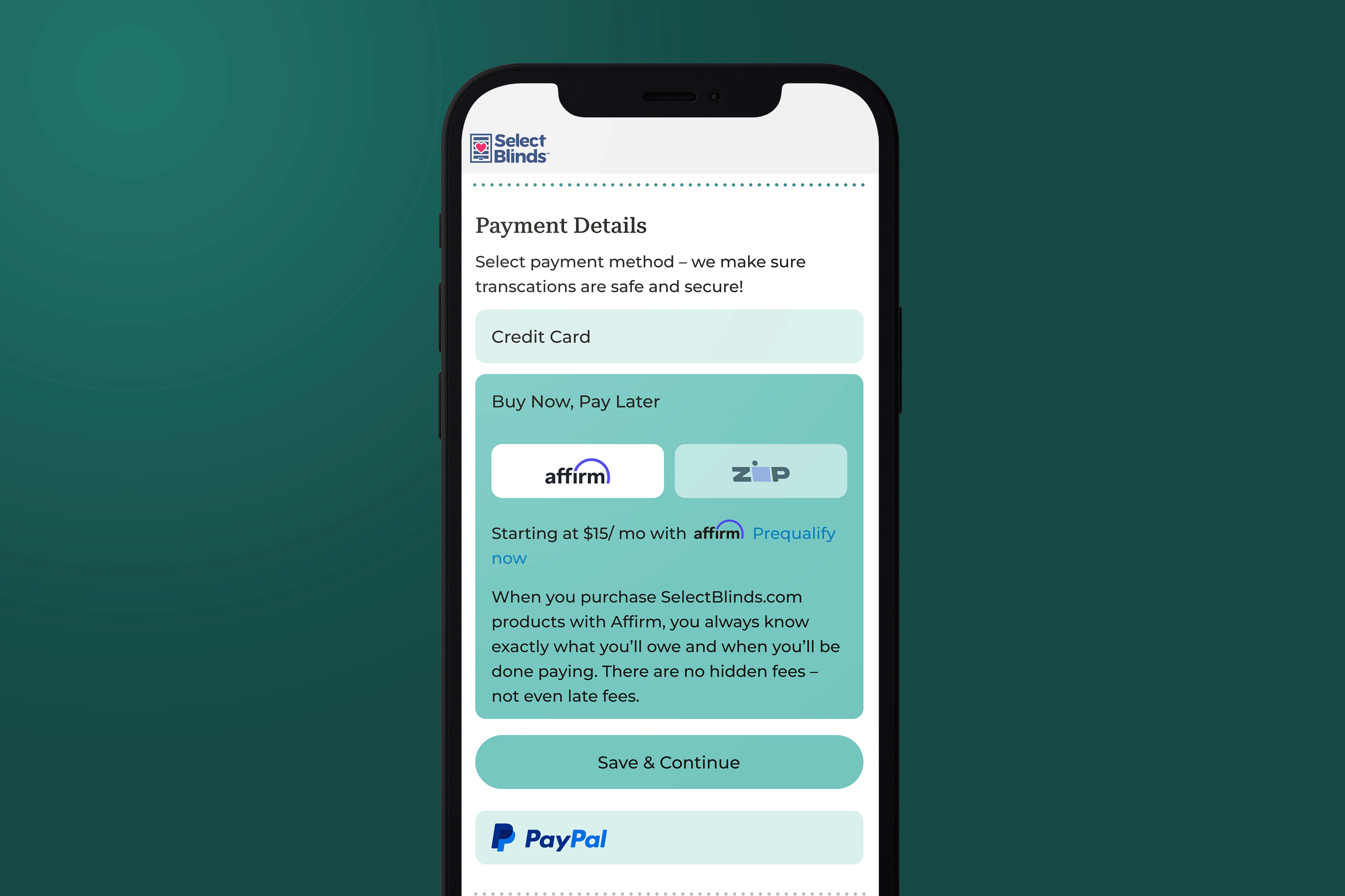
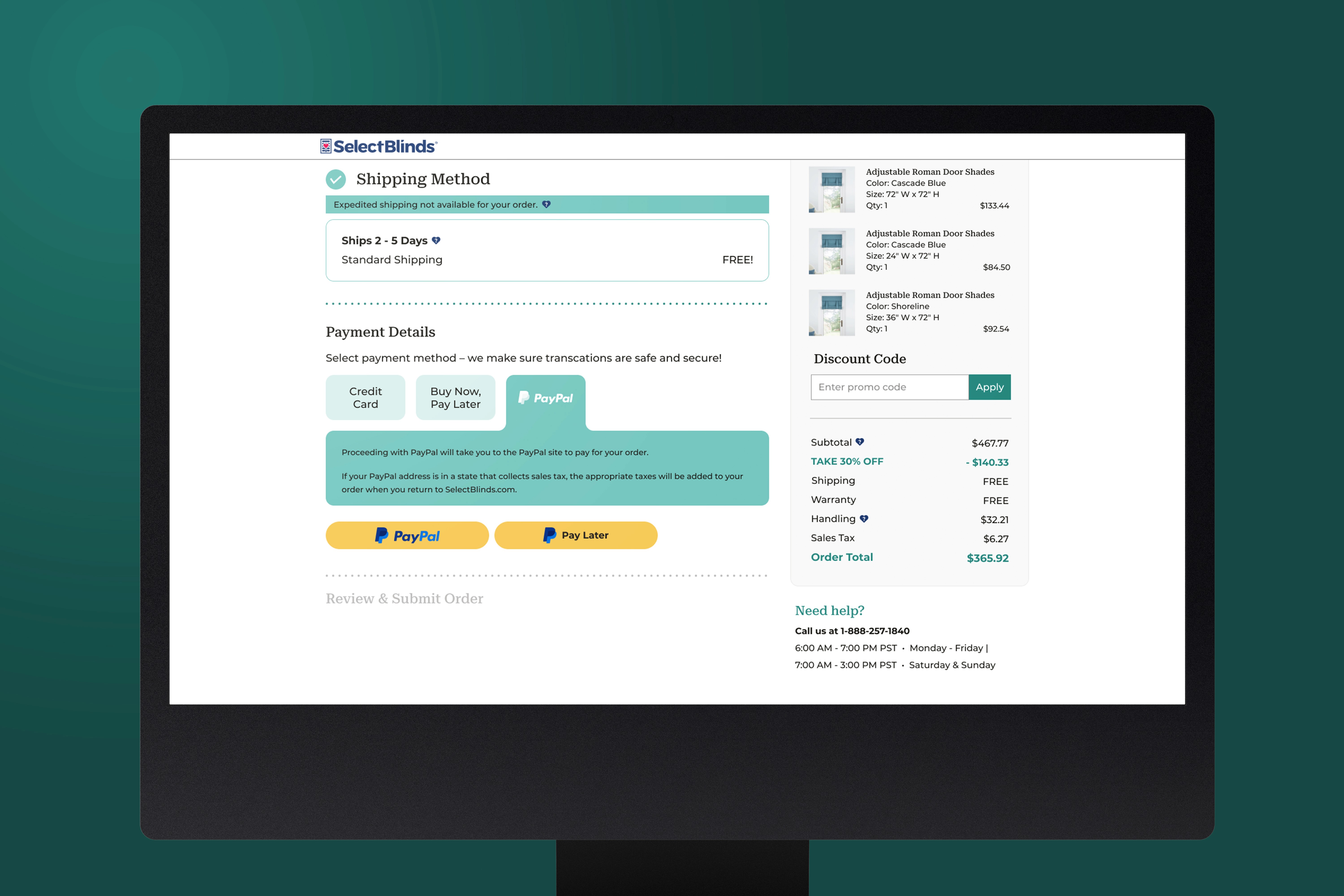
Offer multiple payment options and currencies that suit different customer preferences and location.
Provide a sense of trust and security with customers who are hesitant to use their credit cards or share their personal information.
Personalize the checkout experience and offer relevant upsells, cross-sells and discounts.
Process
To understand the user’s needs and gather feedback, we conducted extensive research using various methods. We analyzed customer behavior with google analytics, listened to customer service calls, assessed our website with Baymard’s usability guidelines, and researched best practices and trends from competitors’ websites.
Before
Key Takeaways
Design was outdated
The process of checking out from start to finish was very convoluted
Baymard Institute determined that the checkout process violated UX principles, and made the process of purchasing an item daunting.
This lead to a large bounce rate when it customers checked out

Discovery
Key Takeaways
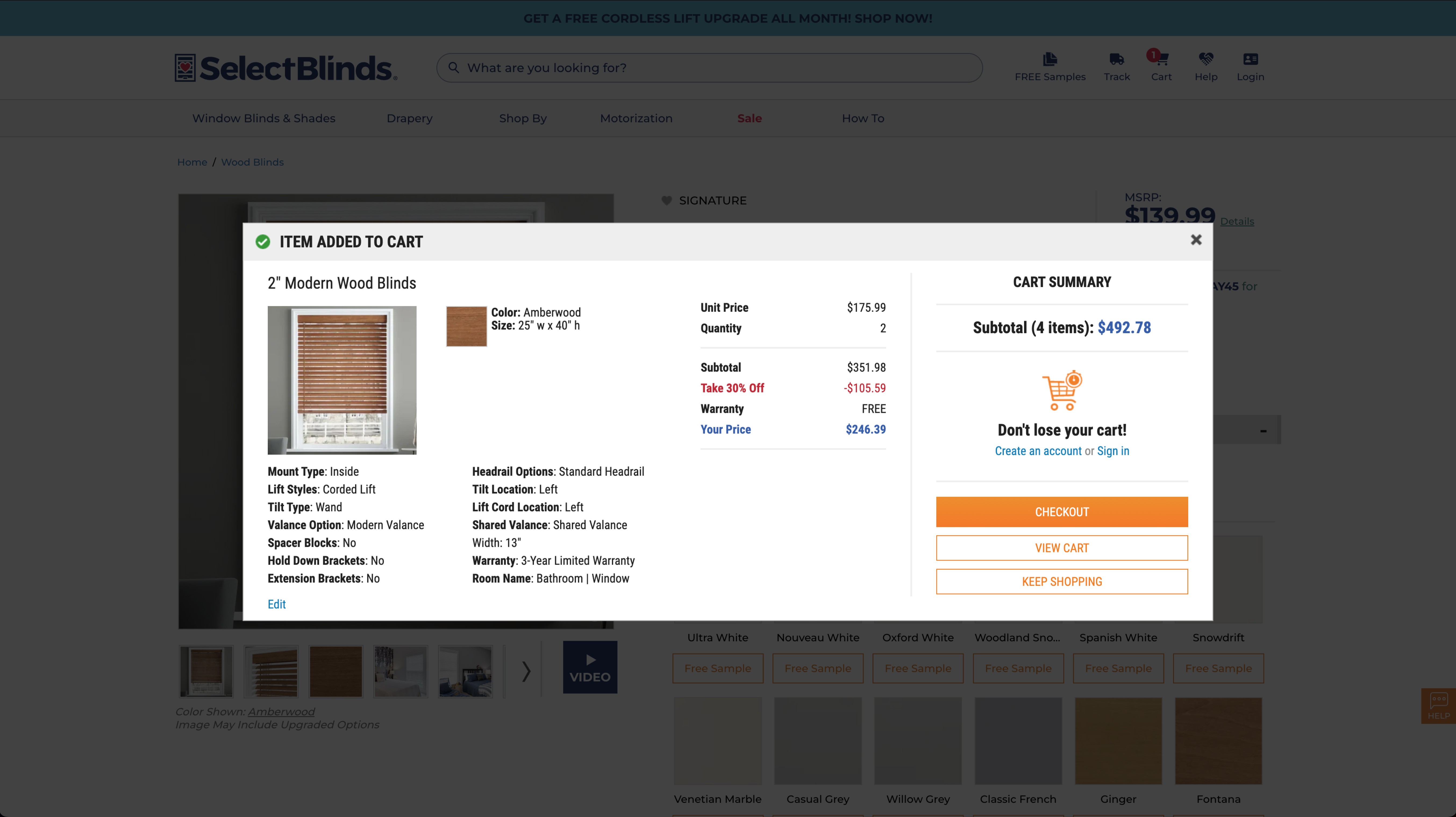
Let customers know the total cost of their order, including shipping and taxes, as soon as possible.
Allow customers to purchase without requiring an account or offer a guest checkout option.
Have less form fields in the checkout flow and only ask for the essential information.
Provide an outline or a progress indicator of the checkout process, such as a numbered list or a progress bar.
Make it easy to update quantity and remove products from the cart, as well as to return to shopping or continue browsing.
Provide clear and relevant call-to-actions on each page of the checkout flow, such as “Continue to Shipping”, “Place Order”, or “Confirm Payment”
Use graphics and copy to soothe customers about site security and trustworthiness, such as displaying security badges, customer reviews, or guarantees.
Brainstorming Solutions
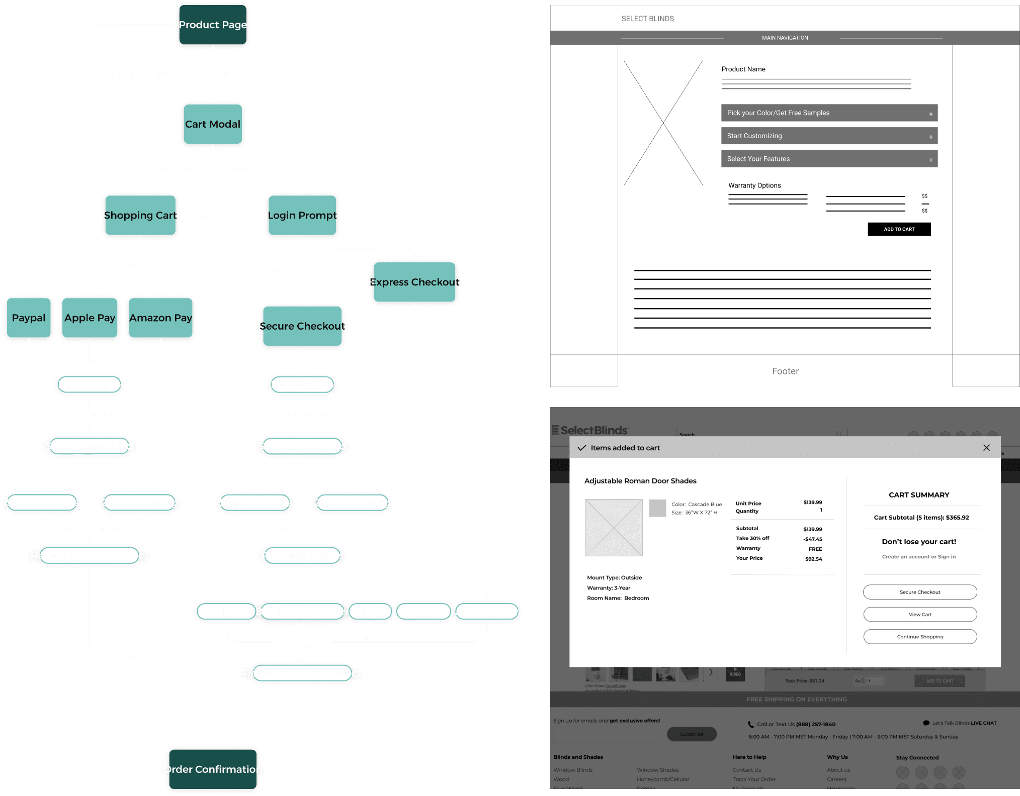
Userflow
Developing a user flow for the checkout process was a significant milestone in the design process. It enabled me to prioritize critical components of the flow and identify any missed steps that required attention. Working collaboratively with other teams, including merchandising, marketing, and IT, I created a user-centric flow that considered every aspect of the journey leading to the eventual sale
First Wireframes
The next step in the design process involved creating rough wireframes, which were basic frames with simple shapes and placeholder text. These wireframes were used to gauge the team’s response to certain changes before refining the wireframes.
Final Wireframes
For the final wireframes, I had gathered most of the information required to proceed with the basic design. I refined the details of spacing, rounding, font sizes, and composition to create the final product. The design of the wireframes was a collaborative effort between me and all the teams, which facilitated a faster and easier completion of the final design with minimal adjustments.
Improvements + Final Designs
The most challenging aspect of this project was the extensive testing that had to be done before launching anything. The project underwent rigorous QA testing, starting from the DEV website, where we performed all the initial tests, then moving to Stage, where we resolved as many issues as possible before launching on the main prod website.

Outcomes
My main responsibility with this project after launch was maintenance and ensuring that everything worked as intended and did not break. Six months later, we observed a significant increase in sales. Although we cannot attribute this solely to the redesign, we noticed a 15% decrease in bounce rate from the checkout, which should correlate with more sales. The redesign also had a positive impact on customer service, as we designed it with the consumer in mind. Fewer customers needed help with their carts and could check out by themselves.