
This project involved several challenges, such as:
Simplifying the color section of the product creation page while adding more features. This was a crucial feature that required streamlining the process and eliminating unnecessary clicks.
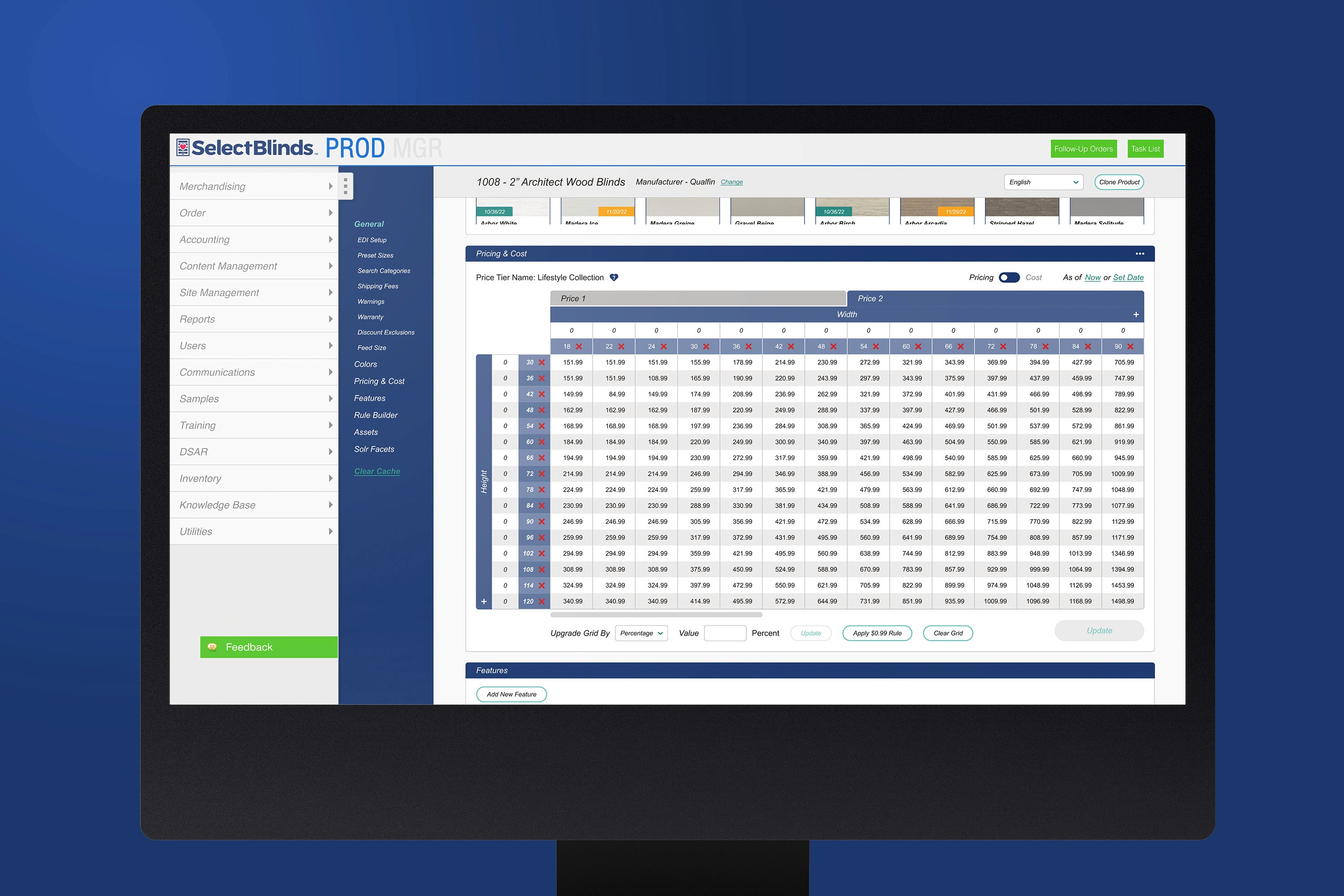
Deciding what to display on the main section of the page and what to move to subpages to reduce clutter. This was complicated by the fact that different products on selectblinds.com had different features depending on their categories (blinds, drapes, shutters, etc.). Choosing which options to keep on the page was one of the main problems I tried to solve.
Persuade the merchandising and marketing staff who used the page. They were reluctant to accept the big and new change to a 15-20 year old section. They were accustomed to the old way of doing things and had their own workarounds for bugs. Convincing them that this was a good thing was a big deal.


The product page redesign project was a great success in improving the user experience and efficiency of the product creation process. It simplified the interface and added more features to help users customize their products. It also reduced the learning curve of MGR (selectblinds CMS) for new employees by making it more intuitive and user-friendly. This project was a milestone for MGR as it was the first big redesign project on the platform. It also served as a guide for how we would approach the redesign of other sections of the website, such as customer service, marketing and developer pages, to make them more consistent and modern.