Prestige Healthcare
A network of skilled-nursing facilities across the East Coast, each with its own front door, running on one identity and one Webflow template system. Twenty-two sites today, built to scale into more.
- Facility template system on Webflow
- Per-site CMS: teams, services, galleries
- Corporate hub with state filtering
- QA, content and launch for the Virginia five
- Ongoing operations: forms, staff changes, campaigns
The brief
Prestige’s clinical reputation had outgrown how it looked. Marks, signage and websites had drifted apart facility by facility. The new identity had to hold the whole network together and still feel local at each front door.
The idea
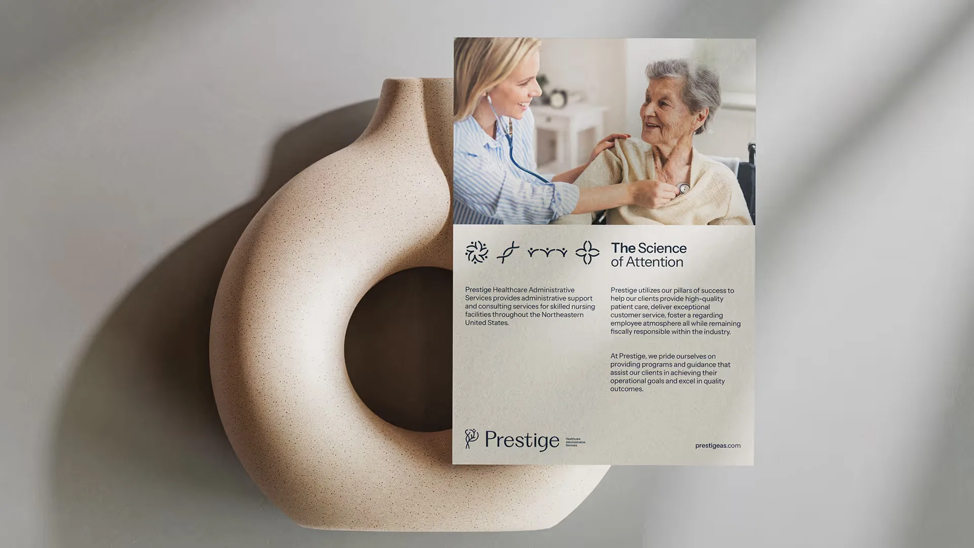
The science of attention. Care comes down to paying attention, to the patient, the family and the staff, so the mark, the type, the palette and the layouts all start from that.
The mark
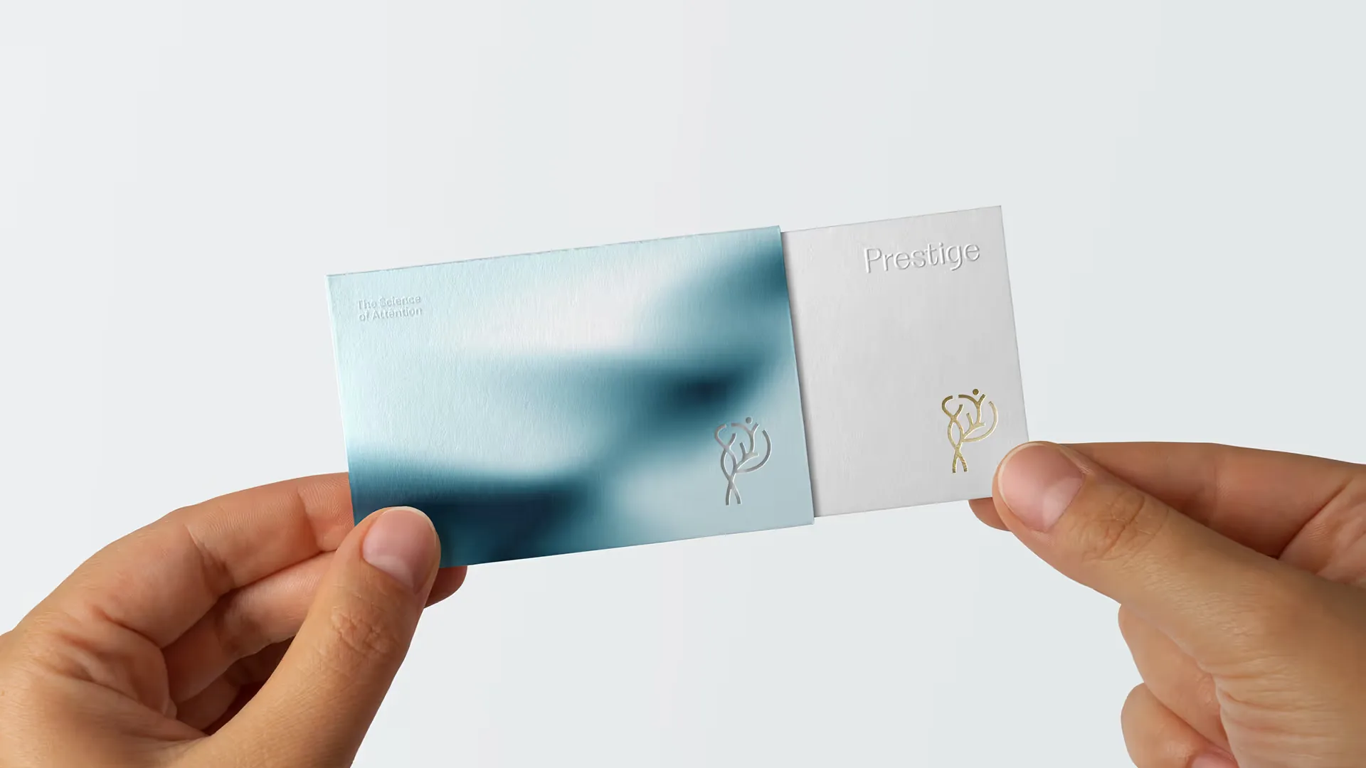
A P built from four drawings: DNA for shared standards, a heart for care, a person for the patient, family and staff, and a tree for growth. Together they form the symbol; on their own they become icons for signage and programs.
The launch
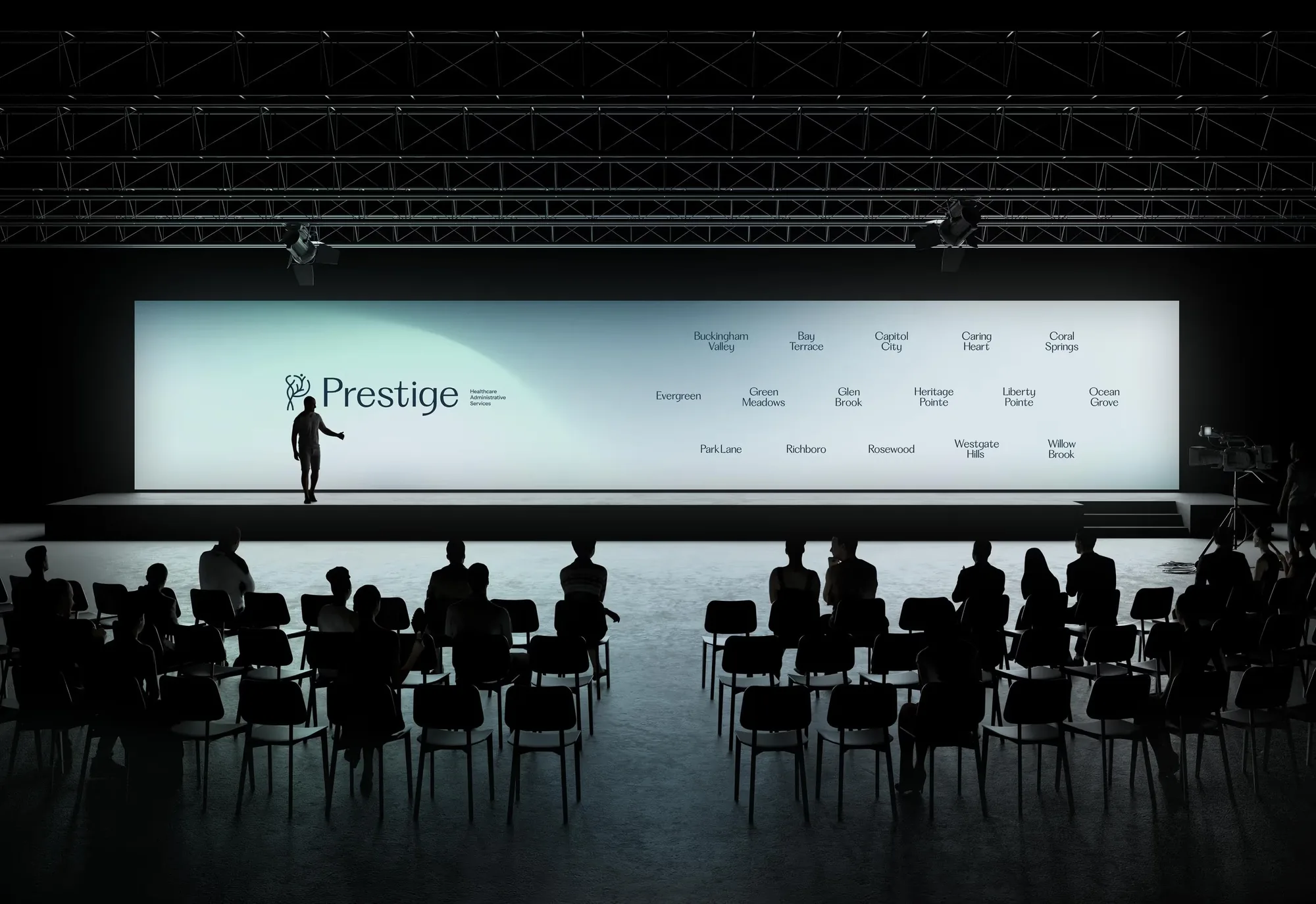
One evening for leadership and staff from every facility: the brand reveal film, a keynote on the science of attention, awards, and merch with the new mark on it.
The web system
Every facility site runs on one Webflow template. Each is cloned and tuned with its own photography, services and team, and the corporate hub filters the network by state.
In motion
Films