Selectblinds Checkout
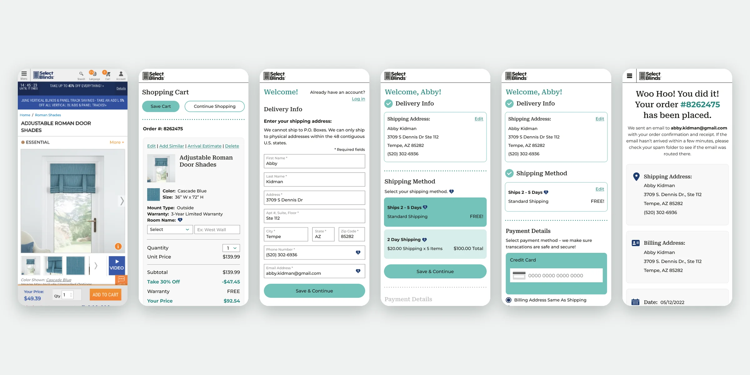
Every product on Selectblinds is unique to the customer’s choices, which made checkout complex and messy. I overhauled it to be clearer and more user-centric — more completed orders, fewer complaints.
- Checkout flow redesign
- Product configurator (MGR/CMS) redesign
- Landing pages, About page, video and animation
The problem
Every blind is built to the customer’s measurements and choices, so a single order carries a lot of detail. The checkout had grown complex and messy around all that detail.
The flow
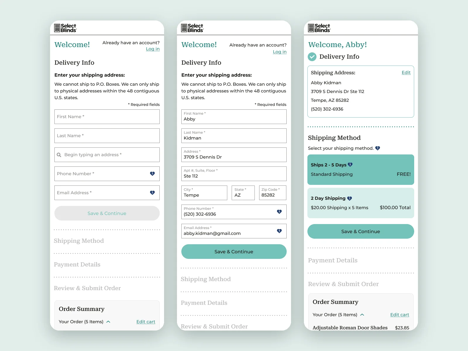
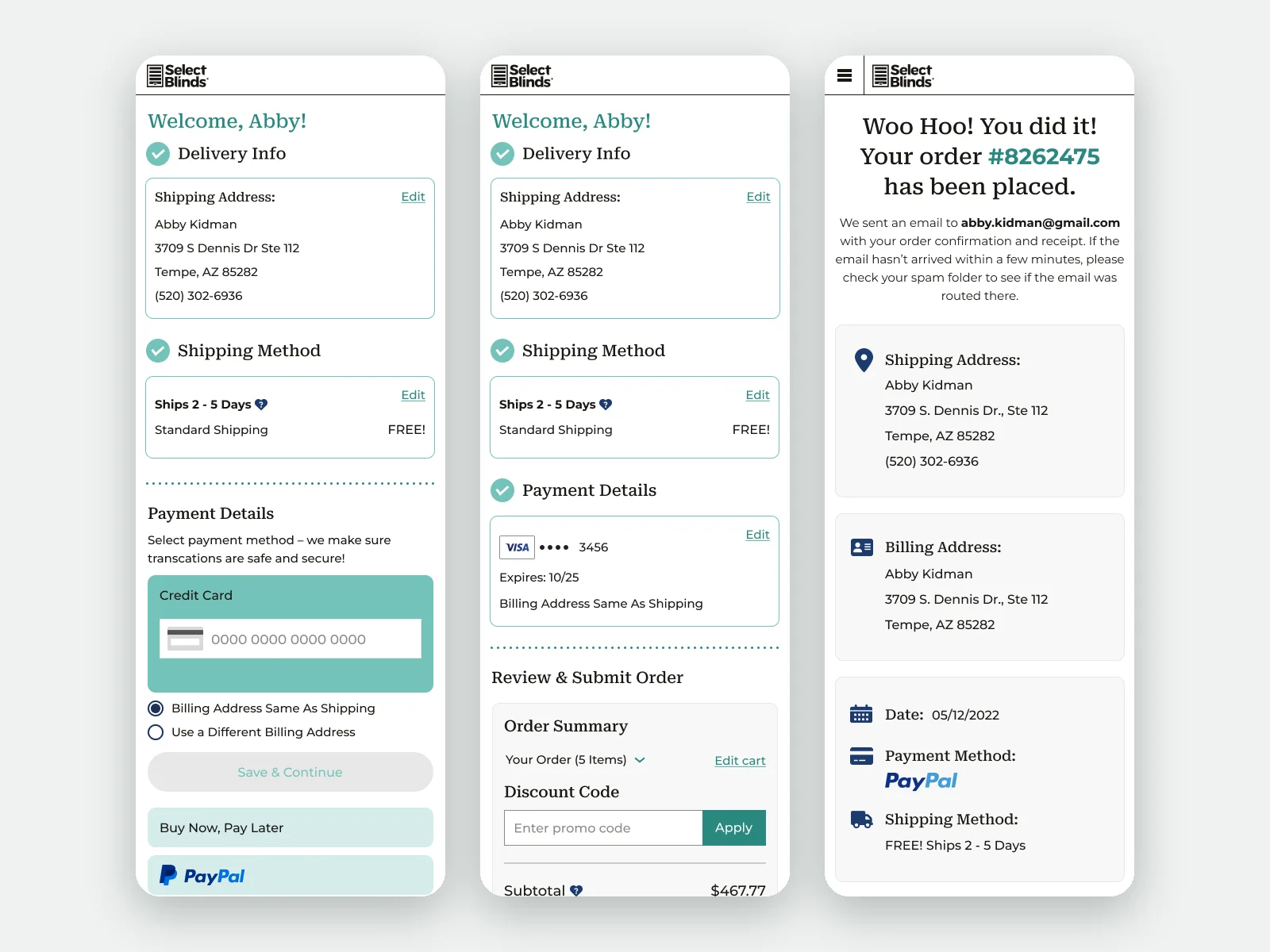
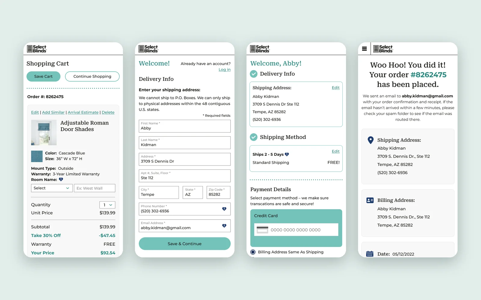
Checkout became four steps that open one at a time: delivery, shipping, payment, review. Each completed step collapses into a short summary with an Edit link, so nothing is lost and the next decision is always the only one on screen.
The details
Address autocomplete with verification, a guest checkout that offers to create an account after the order is placed, plain-language tooltips for tax, handling and room names, and an order summary that stays one tap away.