Towne Group
A global healthcare staffing and strategic-solutions company unifying seven specialized divisions under one identity. The work was to make seven feel like one without flattening any of them.
- Master identity and division system
- Stationery and print collateral
- Environmental graphics
- Brand guidelines
01
The brief
Seven divisions, from Towne RN and Towne Homecare to Towne Kids and Towne School Nurses, each with its own audience. The brand had to hold all of them and still feel premium at every size.
02
Inside out
The work started with the mark and its construction grid, then the colour system, the type hierarchy, a gradient library and a pattern language.
03
In use
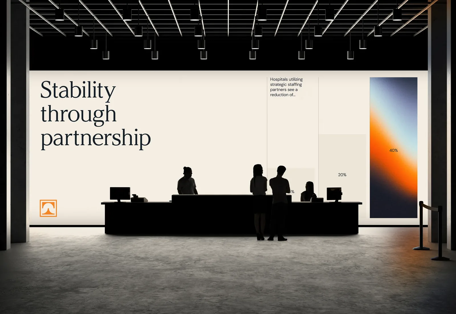
Business cards, letterhead, ID badges, event invites, social and the lobby wall all come from the same parts.
Typography
Argesta DisplayDisplay
DM SansText
Colour
Film
Plays here · sound on
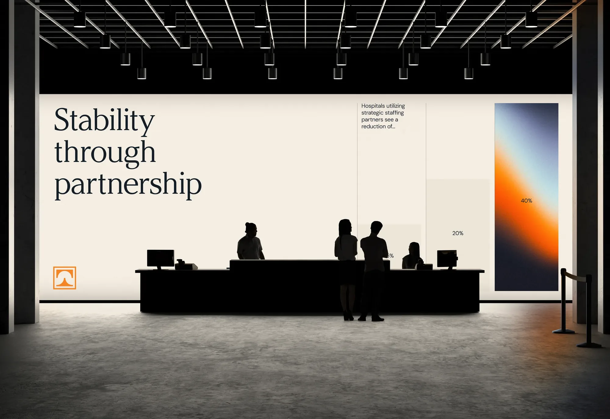
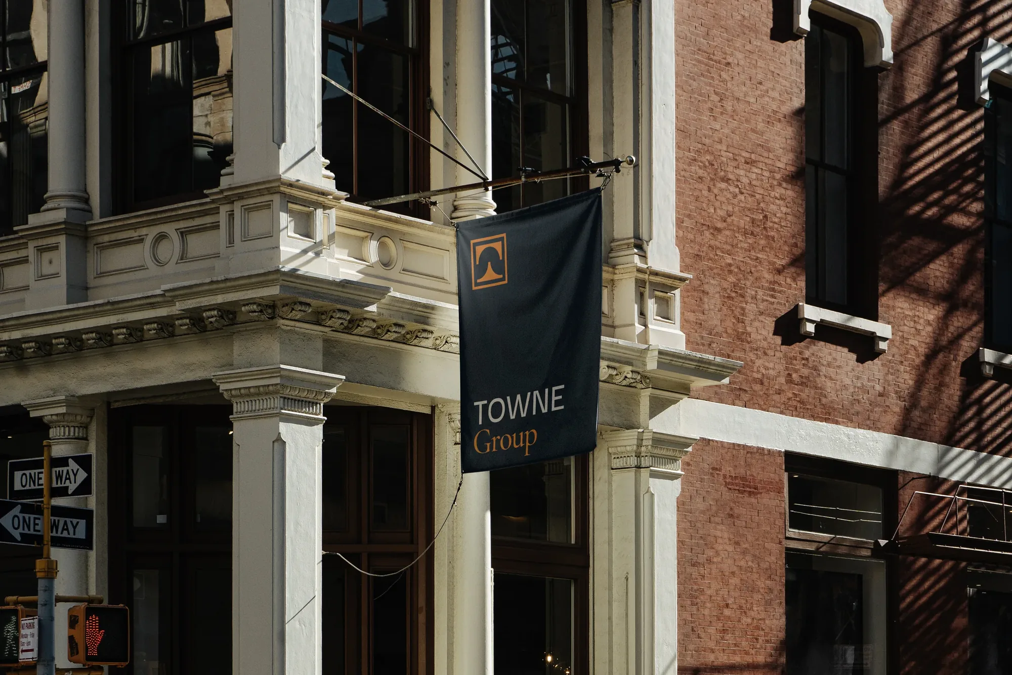
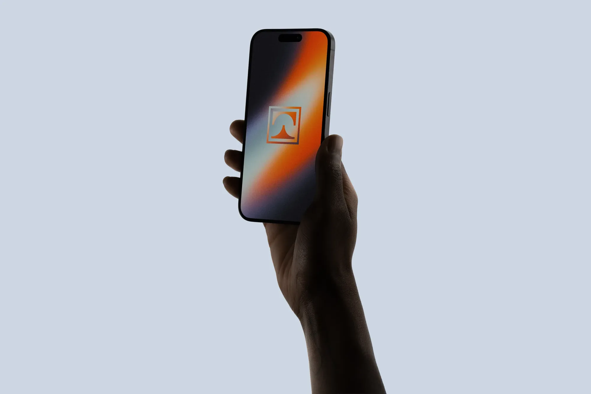
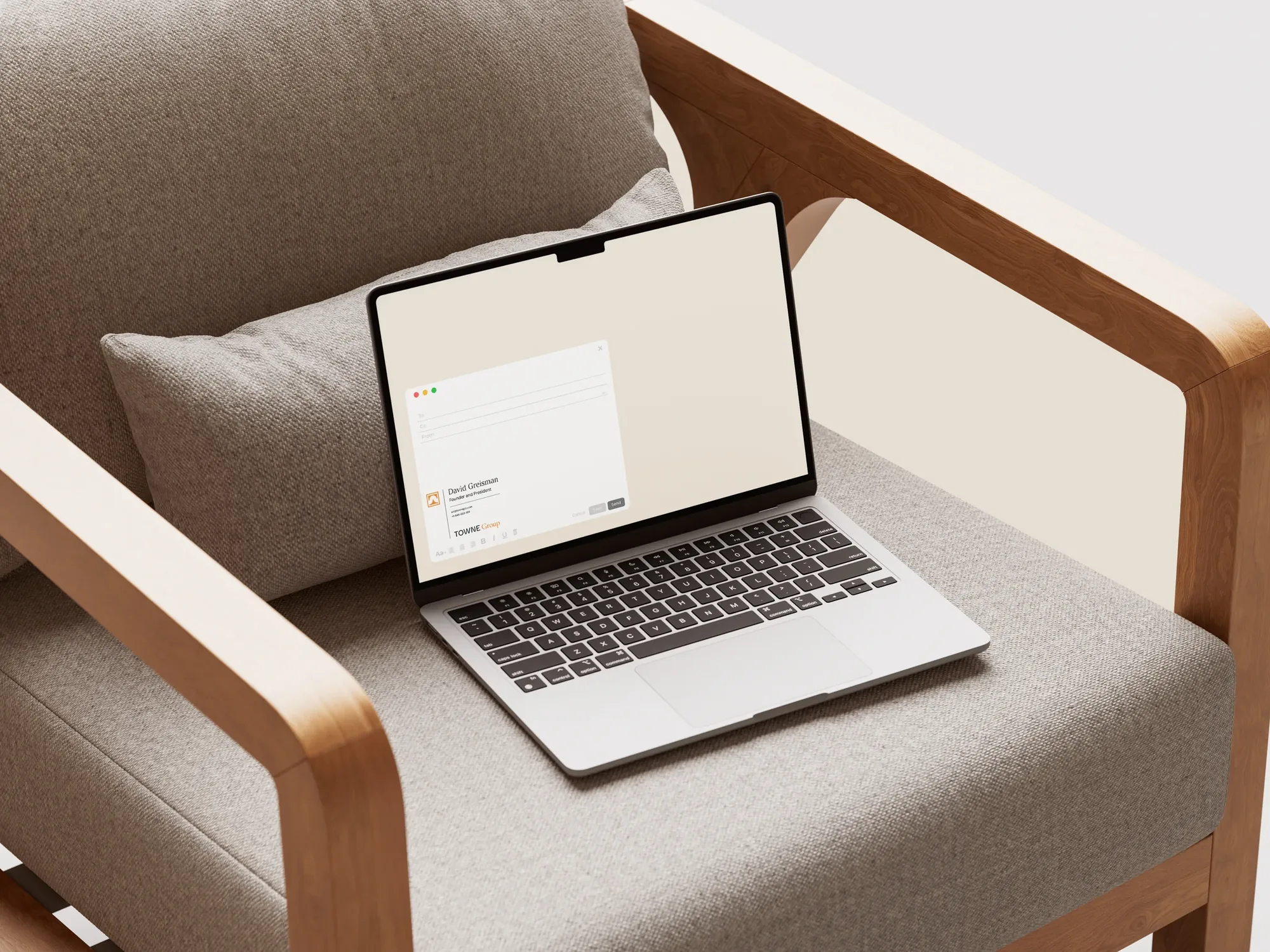
One wordmark, seven divisions, a single system of color and type that carries from a business card to a lobby wall.
At Mozart&Co.