Glades West
A facility already first-choice locally, rebuilt as a brand that converts hospital referrals from the next ring out. New identity, website, a short film for hospital intake iPads, and photography.
- Symbol search — five concepts to one mark
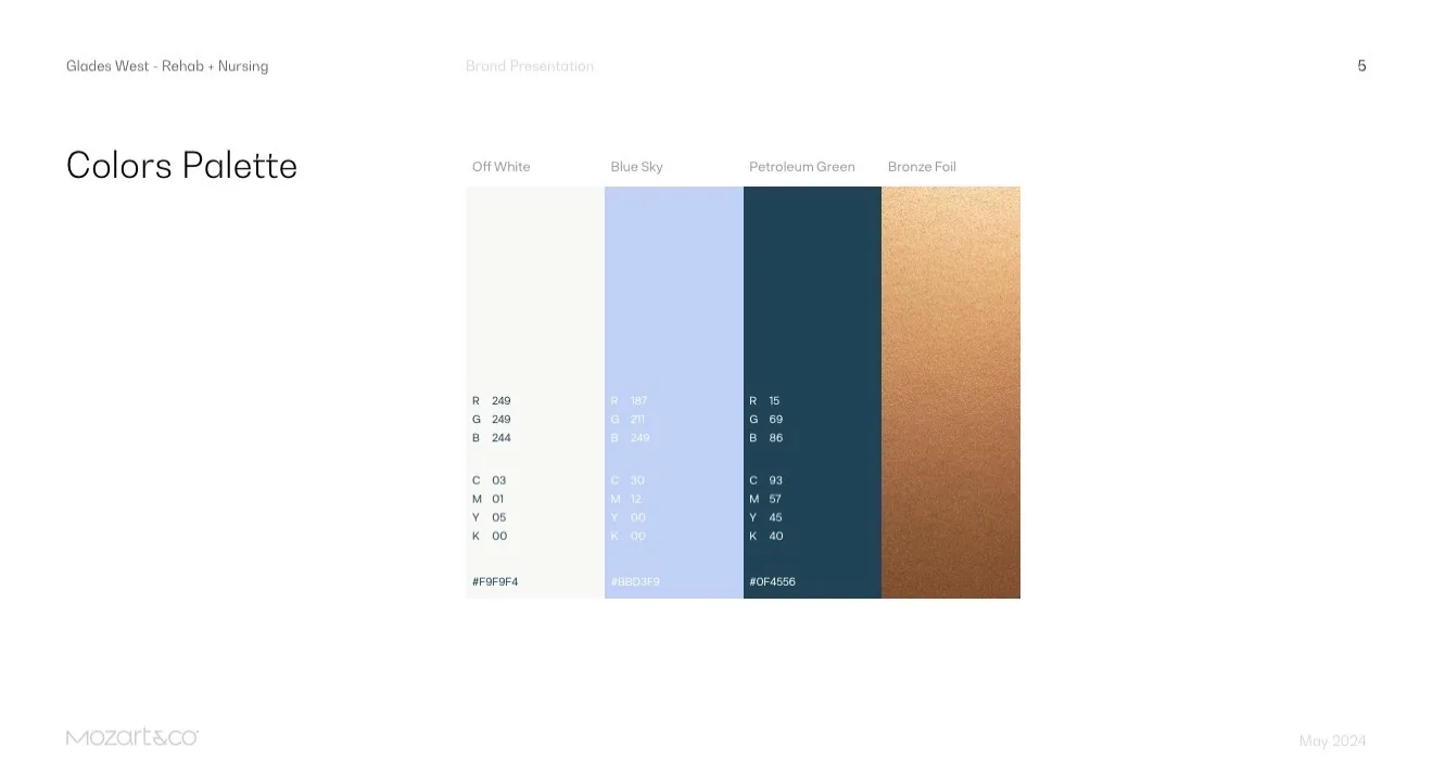
- Four-color system: off-white, sky, petroleum, bronze foil
- Website with online payments
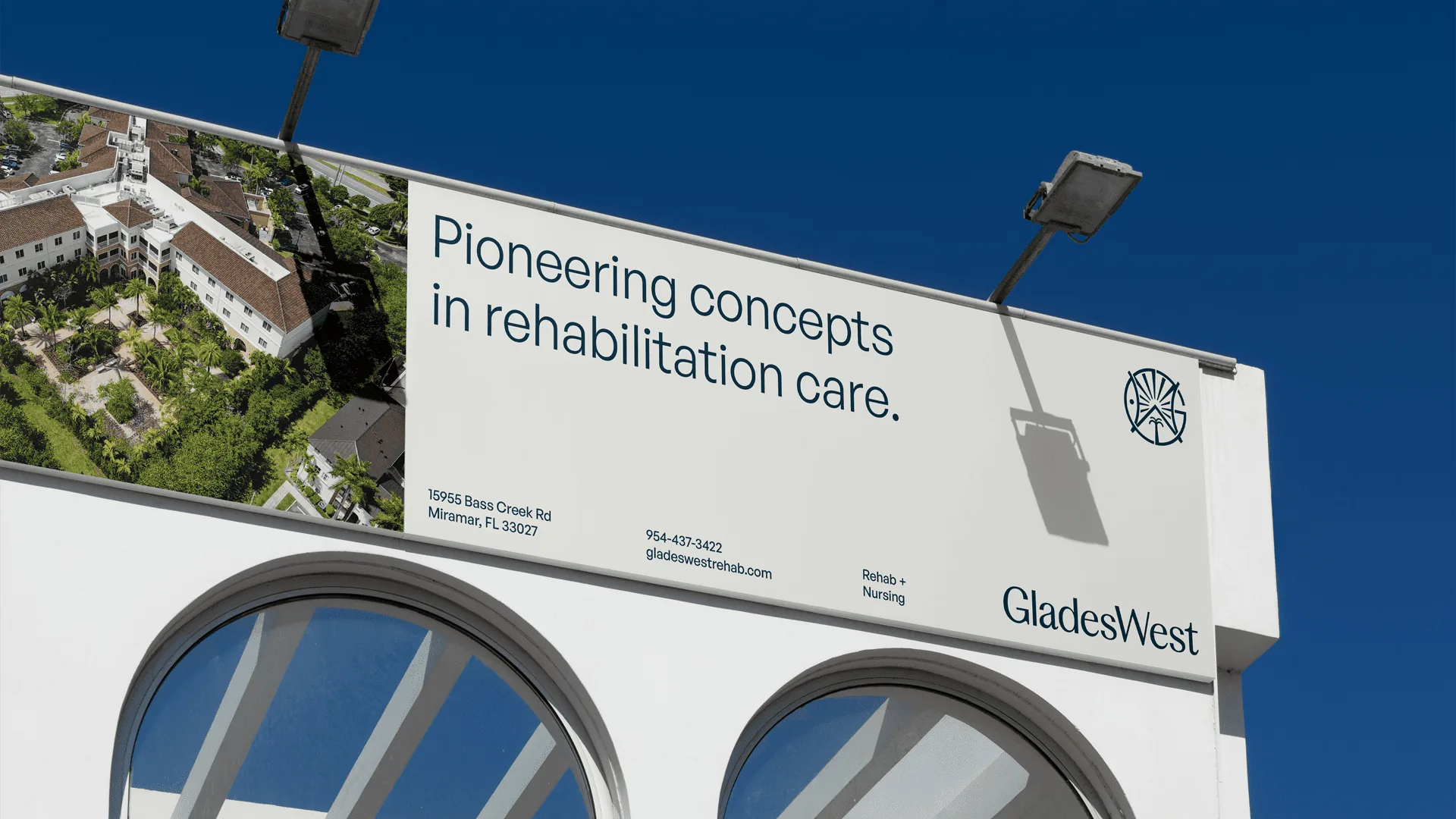
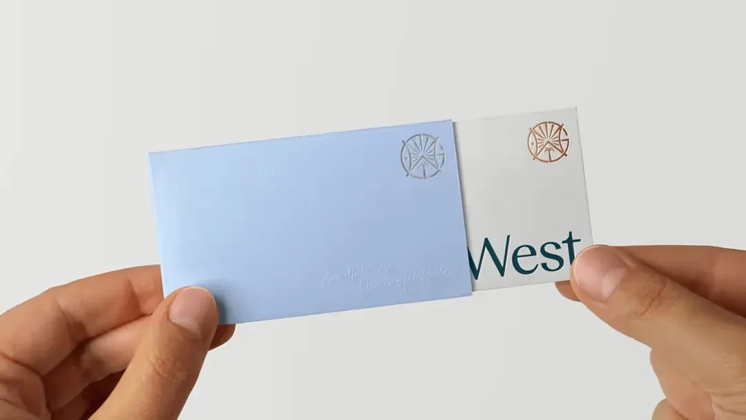
- Stationery and signage
- Brand film and photography direction
The brief
Glades West was already the first choice for patients from nearby hospitals. The goal was the next ring out: referrals from facilities thirty minutes away that had never heard of it.
The mark
Five concepts framed the search: a monogram, a patient mid-therapy, a palm for Miramar, a sunburst, a sheltering home. The final symbol takes a thread from each.
The palette
Four colours carry everything. Off white to breathe, a pale sky to lift, a deep petroleum green to anchor, and bronze foil kept for the moments that should feel earned.
The film
A short film with one job: something the liaisons could open on an iPad in a hospital to show a discharge planner why the drive is worth it.
In motion
Films