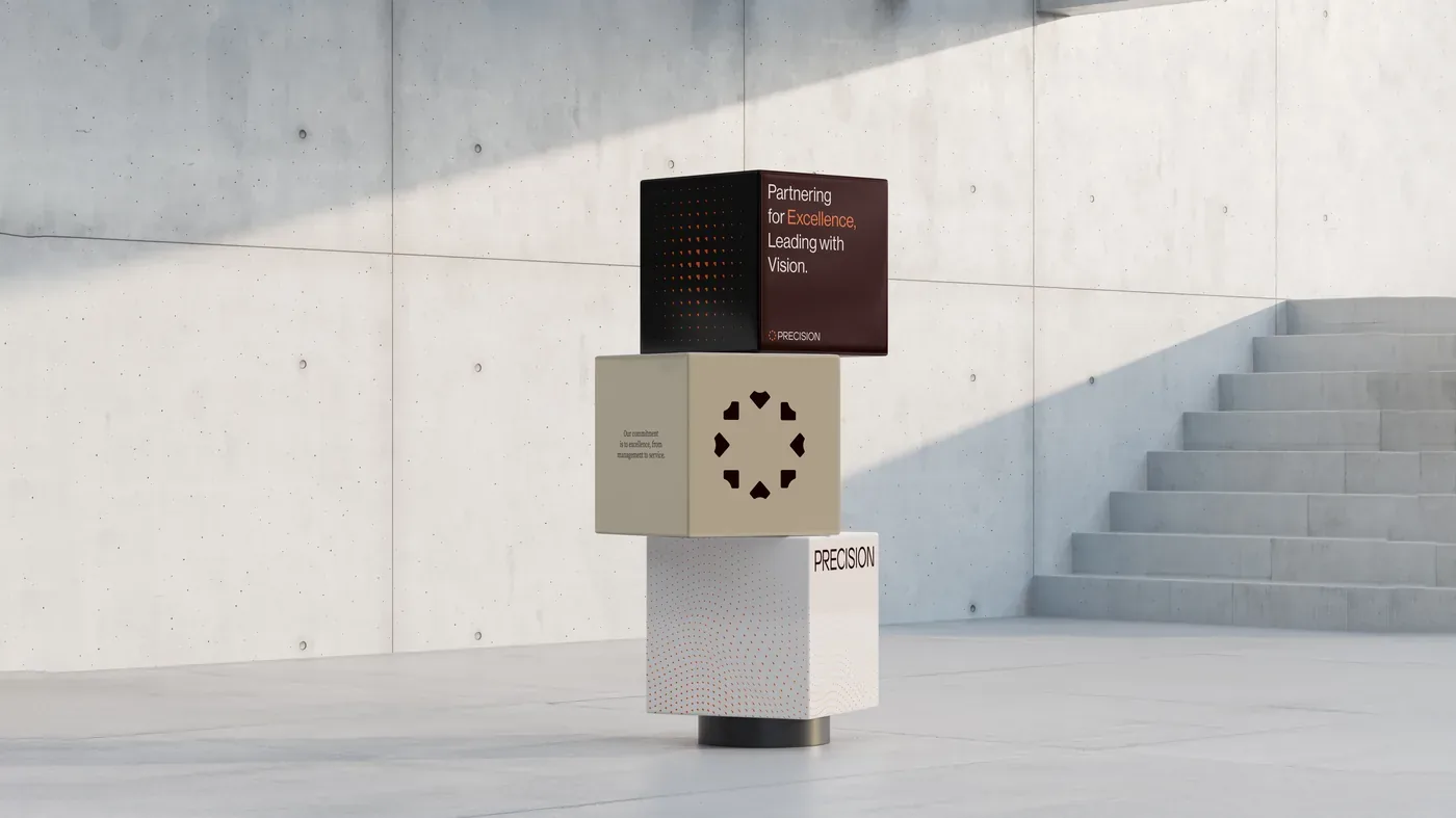
Precision
A complete identity system for Precision Healthcare Services and its portfolio of rehabilitation and long-term care brands — Greenbriar, Wilton Manors, The Ponce, Carlton Shores.
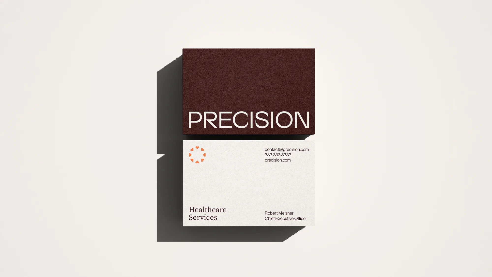
- Wordmark and dotted mark
- Portfolio brand architecture
- Stationery and signage
- Website
01
The brief
A parent company with a growing portfolio of rehabilitation and long-term care brands needed one standard above all of them.
02
The system
A wordmark and dotted mark, then stationery, signage, web and social, every surface held to the same level. The brief for the logotype: expansive, elegant, refined.
Typography
Neue Haas GroteskTitles & running text
Source SerifSubtitles
Colour
Film
Plays here · sound on
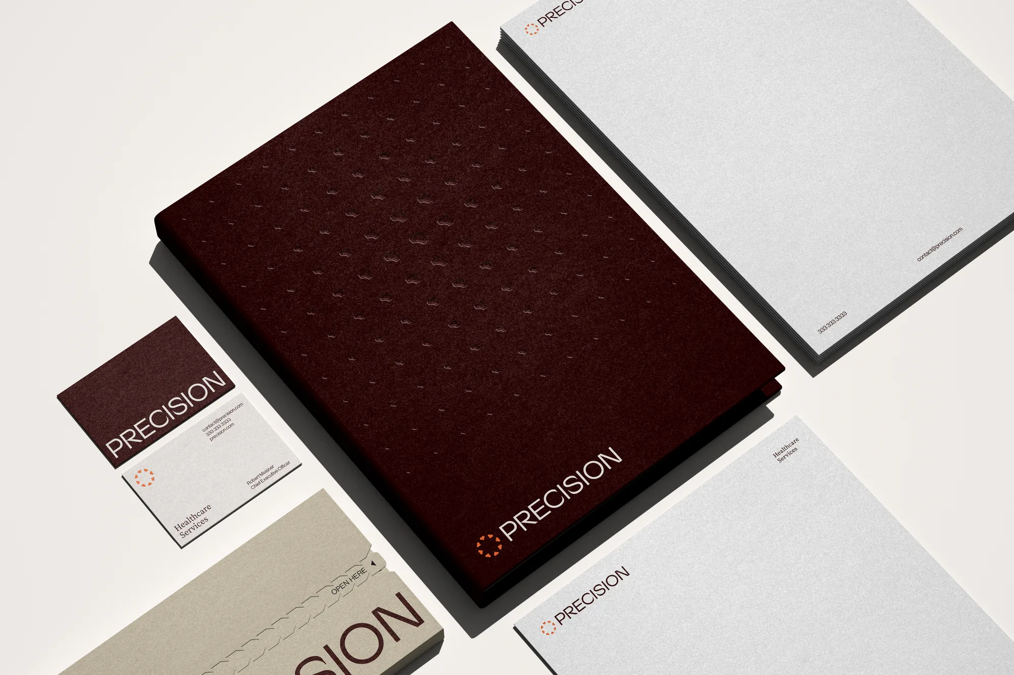
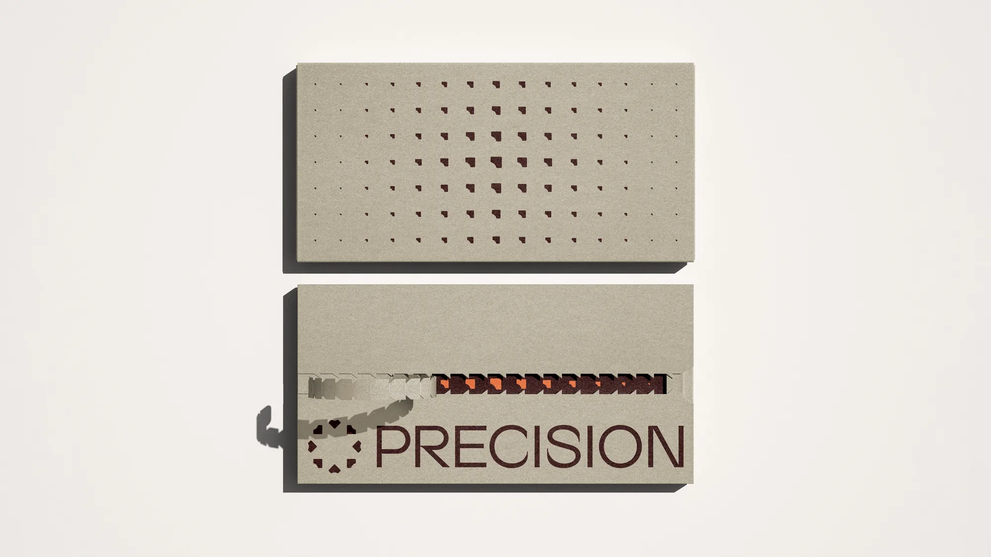
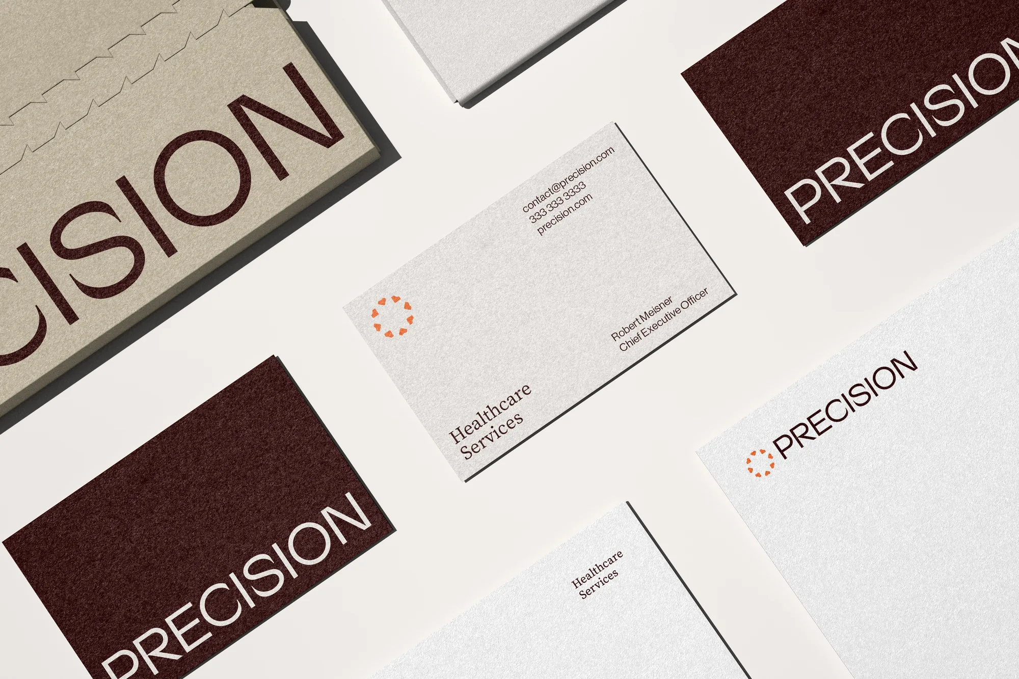
A parent brand strong enough to hold four facility brands without competing with them.
At Mozart&Co.